| Informational Websites | ChronoMaddox -- the legacy of Chuck Maddox | OnTheDash -- vintage Heuer website | Zowie -- Omega information |
| Discussion Forums | ChronoMaddox Forum | Heuer Forum | Omega Forum |
| Counterfeit Watchers | ChronoTools Forum | ChronoTrader Forum |
|
|
The largest independent, non-commercial, consumer-oriented resource on the Internet for owners, collectors and enthusiasts of fine wristwatches. Online since 1998. | |||||||
|
||||||||
|
||||||||

Feel free to discuss pricing and specific dealers. But 'for sale' postings, commercial solicitation and ads are not allowed. Full archive of all messages is accessible through options in the Search and Preferences features. Privacy, policies and administrivia are covered in the Terms of Use.
| For the answer to the NUMBER #1 most frequently asked question here--for details or value of a specific older Omega watch you have--go to: Tell Me About My Omega. | Learn more about How To Include Photos and HTML In Your Postings. | To contact someone with a question not relevant to other readers of the forum, please click on their email address and contact them privately. |
: Is it just me or am I sensing a little
: negativity here? ;-)
Let's just call it dissapointment.
: pic of the regular 2531.80.00. My first
: impression was that the waves were gimmicky.
: And they are. There is no denying it. They
Actually, the commercial photos GREATLY exaggerate the wave effect to the point that it does look gimmicky--if not ridicilous. But you will find that in real life, outside of catalogs and jewelry store lighting the effect is very subtle and only noticable when viewed closely from certain angles.
: Once in a while a manufacturer needs something
: new, something unique that will excite the
: marketplace. IMO, Omega has breathed some
: life into a dull, stagnant, stodgy line of
: watches. No, the 40th Anniversary 007 Model
Funny, that is exactly how I feel about the REGULAR Bond SMP 2531.80. With the subtle wave pattern, offering it with only blue or white dials instead of the overused classic black, skeleton hands and cleverly different basket-weave bracelet design, it is a step apart from the regular watch crowd without looking comic or out of place.
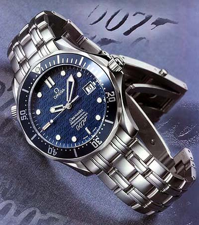
The 007 Limited Edition is only a subtle change from the standard 2531.80. Most noticable is the silver 007 logo near 6 on the dial. Less noticable is the 007 logo pattern covering the dial. The detail on the back of the watch is something that is a nice touch, but not noticed when the watch is worn.
Still, I can easily imagine getting tired of the heavy and inescapable Bond references on the 007LE. I have had my 2531.80 for almost five years now and have no signs of getting tired or bored with it. Hard to go wrong with a real classic! Why settle for anything less--especially if it cost even more?
| Chronocentric and zOwie site design and contents (c) Copyright 1998-2005, Derek Ziglar; Copyright 2005-2008, Jeffrey M. Stein. All rights reserved. Use of this web site constitutes acceptance of the terms of use. | CONTACT | TERMS OF USE | TRANSLATE |